
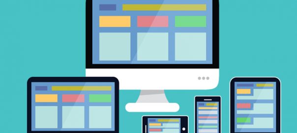
Does every website provide an optimized experience when accessed via a Smartphone or tablet?
It’s not such a big issue if it doesn’t; but everyone now knows the fact that, there are numerous websites coming into existence in every single day. Modern browsers have made the mobile friendly experience for a website in a bearable way with lots and lots of innovations, if websites are not mobile responsive; then that may lead to lose traffic and global reach in this wide-spread online market.
Why websites to be made mobile friendly?
A mobile friendly website design offers plethora of benefits such as.,
- More traffic
- Increased social shares and sales
- Additional email subscribers
- Access of your site in all devices
- Better user experience
Here are 4 ways to optimize your website suitable for mobile devices:
Separate Mobile Site creation
Every Smartphone user will be familiar with how certain sites offer a version specific for phones. For example, Facebook and other social media platforms have a separate application for mobile users. It will be only with slight modifications from the normal site, but the general capability is still remains the same.
Simplification
The mobile version of a website should be very simple, well organized and with required space, this will help viewers not get overwhelmed by too many features. Drop-down menus in the mobile sites will help to eliminate unnecessary distractions this provides simplified navigation.
Emphasize Prominent Information
Informations and elements from the original site to keep for mobile site have to be clearly decided first. Appropriate name, contact information, and a photo or logo should be very clearly displayed. If someone is in hunt to find key information, most important message should be clearly and concisely emphasized in the mobile sites.
Provide Links to the Full Site
If someone first come across your website while using a phone, users will be more likely to fully interact and take advantage of services through the original site. So remember that the mobile version is meant to serve as a mini format of your main website. The full site is the main attraction and ultimately where you want your viewers to go. Make sure to provide a link to redirect viewers to your full site.
What else you want? This is the RIGHT time to transform your websites into mobile responsive design. Contact us to make your website as mobile responsive site.
 Quality with Fast Turn Around
 +65 93892999
 info@angleritech.com.sg